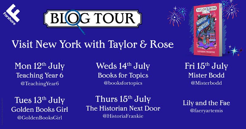
Blog Tour: ‘Nightfall in New York’ with Katherine Woodfine and Karl James Mountford


When the opportunity arose for me to join the blog tour for the release of the final part of Katherine Woodfine’s Taylor and Rose: Secret Agents series, I immediately leapt at the chance to write about the role of illustrator Karl James Mountford in the realisation of these wonderful detective stories.
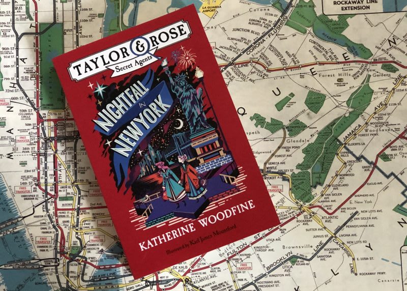
Nightfall in New York sees Woodfine’s heroines Sophie and Lil venture to yet another city in their fight against the criminal organisation known as the Fraternitas Draconum. Set in 1912 and filled with historical details about London, New York and the luxurious ocean liner voyage in between, this book is a non-stop adventure that grabbed me from the very first sentence. The lead characters and their friends are smart, fearless and utterly engaging. Their friendship is so beautifully written that it is no surprise that readers have been so invested in their adventures around the world. The book is also full of illustrated clues that allow us to share what Sophie and Lil see as they try to solve the mystery, stay out of danger and save those who are most important to them.
I spoke to illustrator Karl and author Katherine about the illustrations that are such an integral part of this book series.
Q. Many of the images in the books are of the clues that are vital to solving the mysteries. The reader gets to see that information just as the characters do and join them on their journeys through the story. Karl, how do you decide which parts of the text should become illustrations?
Karl: A very patient soul at the publishing house (I’m not 100% sure who) makes a list of the chapters that could be illustrated from within the story. Since Katherine’s books have clues throughout it is usually these that are illustrated so the reader can take part inspecting the clues themselves.
Q. Further to that, is there any degree of collaboration between the two of you when it comes to deciding what the images should contain?
Karl: Not really, publishers like to keep authors and illustrators at a distance – which I can understand but also don’t. And they have an extensive brief for the illustrations and Katherine makes really helpful Pinterest boards for each book to show a flavour of time, fashion and design etc.
Katherine: Typically, when I am writing my first draft, I make a note wherever I think an illustration would work well – for example where we need to see something like a letter or a page from a diary. Then, when the manuscript goes off to my editor, Sarah, she and the designer, Laura, will begin putting together a brief for Karl based on my suggestions, as well as their thoughts about other illustrations we might include.
At this point, I’d also share any specific visual reference points I’ve used as part of the research and writing process – such as a Pinterest board (here is the one I made for Nightfall in New York) or particular historical images that would be relevant.
We don’t usually chat directly about the details of the artwork, but Karl might send me a quick message if he has a specific question – for example, about how a particular character should look.
Later on, I’ll get to see Karl’s roughs for the cover and interiors. There’s the opportunity to feed back, but mostly it’s just ‘Wow, I absolutely love it!’ Sometimes there are small tweaks to make, or we might even decide that another illustration is needed somewhere.
Finally, seeing the finished artwork is always a really special and exciting moment!
In general, being involved in this aspect of the books is a total joy for me. I love illustration and book design, and I’m a huge fan of Karl’s work, so it’s been wonderful to have the opportunity to get an insight into the process.
Q. One of my favourite illustrations in Nightfall in New York is the poster that advertises the reopening of a Coney Island amusement park. It is absolutely packed full of adventure and excitement. Your illustrations convey the historical details of the time such as the fashions and technology. How do you research the historical information for your images?
Karl: [As she mentioned earlier] Katherine has a Pinterest board for each book, and when we start making illustrations I tend to look at them for a lot of inspiration and also to get things right. As we’re using a lot of history in the books, even though the story might not be true, the setting is. Also, if I get super lost on something I’ll reach out to Laura and ask for clarification on what an object should look like etc. A lot of the time I’d just google ‘1911 fashion, cars, tickets’ etc and just try to make a small folder as a resource.
Q. Katherine, as an author, how do you feel that Karl’s images enhance your stories?
Katherine: Immensely! Karl’s artwork brings so much to the series. The books are really beautiful objects in themselves, with covers that inspire the reader to pick them up, and perfectly convey the feeling and atmosphere of the story inside.
Then there’s the internal illustrations, which add a tremendous amount of depth and richness. I always knew that I wanted these books to include lots of images – newspaper clippings, letters, maps and other artefacts – classic detective story ‘clues’ which also help to give the story a sense of texture, time and place. Each of Karl’s illustrations is so carefully thought about and researched with reference to the design and aesthetics of the historical period. I think they do a huge amount to bring Sophie and Lil’s adventures to life, and vividly evoke that feeling of a specific time and place.
One thing I particularly love is the way Karl works intriguing little details and fun extras into the pictures (as I sometimes do myself, within the text!) which sharp-eyed readers can spot and enjoy. Altogether, his illustrations don’t just complement the story, they add to it, and enrich it – turning it into something extra special.
The cover art for each of the books is stunning and conveys the major landmarks of each city in which the action happens. Do you either of you have a favourite of the four Taylor and Rose covers, and why?
Karl: It’s between Spies in St Petersburg and Nightfall in New York. They both have good colour combos which is important as we restrict our palette with these books. I think they work well doing their job in grabbing the eye of a readerbut also reflect an entire world and tone within the book.
Katherine: This is an absolutely impossible question to answer as I love ALL the covers – I honestly don’t think I could pick a favourite. In terms of the interior illustrations, there are so many that I could choose, but I do particularly love the poster for the night-club La Lune Bleue which appears in Peril in Paris.
In Nightfall in New York, I especially love the newspaper spread at the very end, and particularly the picture of Sophie and Lil together. It’s really the very last thing we see of them – and it beautifully captures them at the end of the series, as well as their relationship with each other. It feels like exactly the right note to leave them on.
Q. Katherine has already mentioned Laura Bird who was the designer on Nightfall in New York. Karl, could you explain a little about the role of the designer in creating an illustrated book such as this?
Karl: Laura is crucial in how we develop the artwork and also orchestrates ideas and information between different divisions, departments, the author and myself. Laura is the one we all go to when developing the design/illustrations.
Also, when my part of the job is over Laura will sort out the layout of the entire book, where images go and test foiling proofs (the shiny parts of the cover.) The designer is an essential role in book making.
Q. And as an illustrator, what are the advantages to working on a series of books and what have you enjoyed most about illustrating this series?
Karl: The advantages are …you know you’ve got a job for a little longer. But also it’s nice to really jump in and be a part of the team. We’re all trying to make Katherine’s stories into a great looking book. You become a fan of the stories, I’ve read all of Katherine’s books and you invest in the narrative just as much as the artwork.
It will be odd not having another Katherine Woodfine brief come through now as ‘The Painted Dragon’ was one of my first ever proper jobs as an illustrator. But here we are 6 books later saying goodbye to Sophie and Lil.
Thanks to both Karl and Katherine for their wonderful answers! The whole Taylor and Rose: Secret Agents series is available from all good booksellers.
To find out more about Katherine Woodfine you can visit her website at followtheyellow.co.uk. You can also follow her on Twitter and Instagram.
You can see more of Karl James Mountford’s beautiful illustrations here and follow him on Instagram and on Twitter.
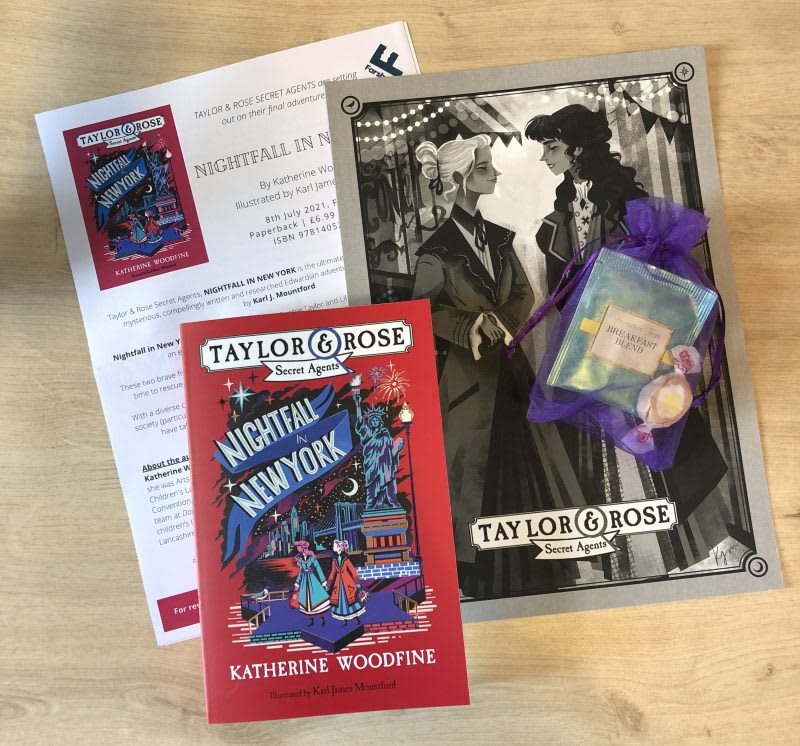
Thank you to Farshore for sending a review copy.
Disclaimer: This page contains affiliate links to bookshop.org and will redirect you to their website. If you make a purchase I will make a very small commission at no extra cost to you and they also share their profits with independent bookshops around the UK.